| Age | Commit message (Collapse) | Author | Lines |
|---|
|
|
|
|
|
This is an attempt to balance three problems, each of which would
be violated by a simpler implementation:
- A type alias should show all the `impl` blocks for the target
type, and vice versa, if they're applicable. If nothing was
done, and rustdoc continues to match them up in HIR, this
would not work.
- Copying the target type's docs into its aliases' HTML pages
directly causes far too much redundant HTML text to be generated
when a crate has large numbers of methods and large numbers
of type aliases.
- Using JavaScript exclusively for type alias impl docs would
be a functional regression, and could make some docs very hard
to find for non-JS readers.
- Making sure that only applicable docs are show in the
resulting page requires a type checkers. Do not reimplement
the type checker in JavaScript.
So, to make it work, rustdoc stashes these type-alias-inlined docs
in a JSONP "database-lite". The file is generated in `write_shared.rs`,
included in a `<script>` tag added in `print_item.rs`, and `main.js`
takes care of patching the additional docs into the DOM.
The format of `trait.impl` and `type.impl` JS files are superficially
similar. Each line, except the JSONP wrapper itself, belongs to a crate,
and they are otherwise separate (rustdoc should be idempotent). The
"meat" of the file is HTML strings, so the frontend code is very simple.
Links are relative to the doc root, though, so the frontend needs to fix
that up, and inlined docs can reuse these files.
However, there are a few differences, caused by the sophisticated
features that type aliases have. Consider this crate graph:
```text
---------------------------------
| crate A: struct Foo<T> |
| type Bar = Foo<i32> |
| impl X for Foo<i8> |
| impl Y for Foo<i32> |
---------------------------------
|
----------------------------------
| crate B: type Baz = A::Foo<i8> |
| type Xyy = A::Foo<i8> |
| impl Z for Xyy |
----------------------------------
```
The type.impl/A/struct.Foo.js JS file has a structure kinda like this:
```js
JSONP({
"A": [["impl Y for Foo<i32>", "Y", "A::Bar"]],
"B": [["impl X for Foo<i8>", "X", "B::Baz", "B::Xyy"], ["impl Z for Xyy", "Z", "B::Baz"]],
});
```
When the type.impl file is loaded, only the current crate's docs are
actually used. The main reason to bundle them together is that there's
enough duplication in them for DEFLATE to remove the redundancy.
The contents of a crate are a list of impl blocks, themselves
represented as lists. The first item in the sublist is the HTML block,
the second item is the name of the trait (which goes in the sidebar),
and all others are the names of type aliases that successfully match.
This way:
- There's no need to generate these files for types that have no aliases
in the current crate. If a dependent crate makes a type alias, it'll
take care of generating its own docs.
- There's no need to reimplement parts of the type checker in
JavaScript. The Rust backend does the checking, and includes its
results in the file.
- Docs defined directly on the type alias are dropped directly in the
HTML by `render_assoc_items`, and are accessible without JavaScript.
The JSONP file will not list impl items that are known to be part
of the main HTML file already.
[JSONP]: https://en.wikipedia.org/wiki/JSONP
|
|
This reverts commit d882b2118e505d86a9f770ef862fb1ee6e91ced8.
|
|
This reverts commit c3e5ad448b87be31e570c048cf7ba3b1e7daec44.
|
|
rustdoc: show crate name beside smaller logo
*Blocked on https://github.com/rust-lang/cargo/pull/12800*
## Summary
In this PR, the crate name and version are always shown in the sidebar, even in subpages, and the lateral navigation is always shown in the sidebar, even in modules.
Clicking the crate name does the same thing clicking the logo always did: take you to the crate root (the crate's home page, at least within Rustdoc).
The Rust logo is also no longer shown by default for non-Rust docs.
### Screenshots
<details><summary>Before</summary>
| | Macro | Module |
|--|-------|--------|
| In crate | 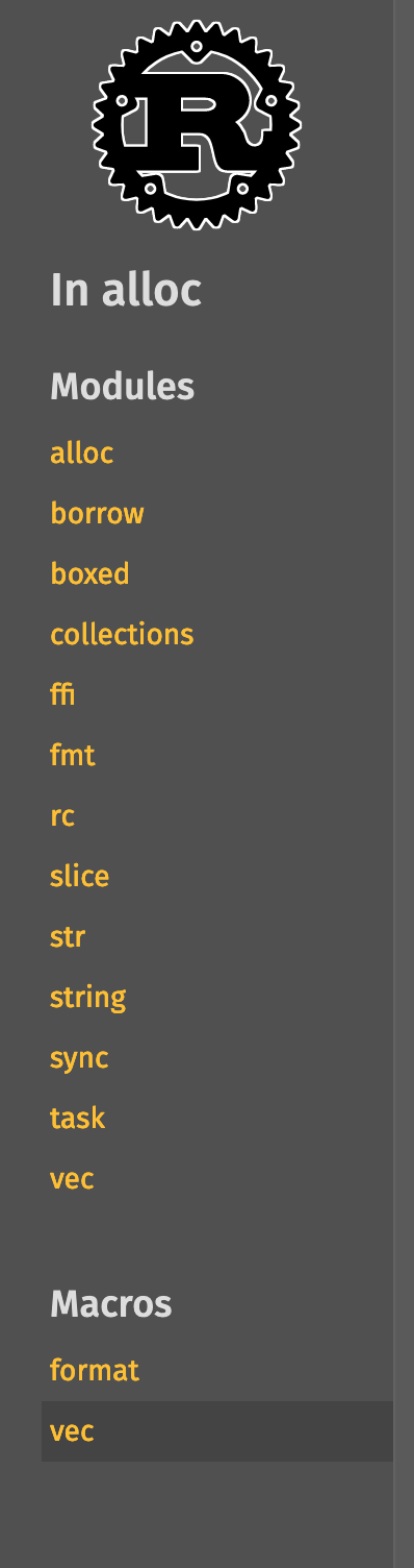 |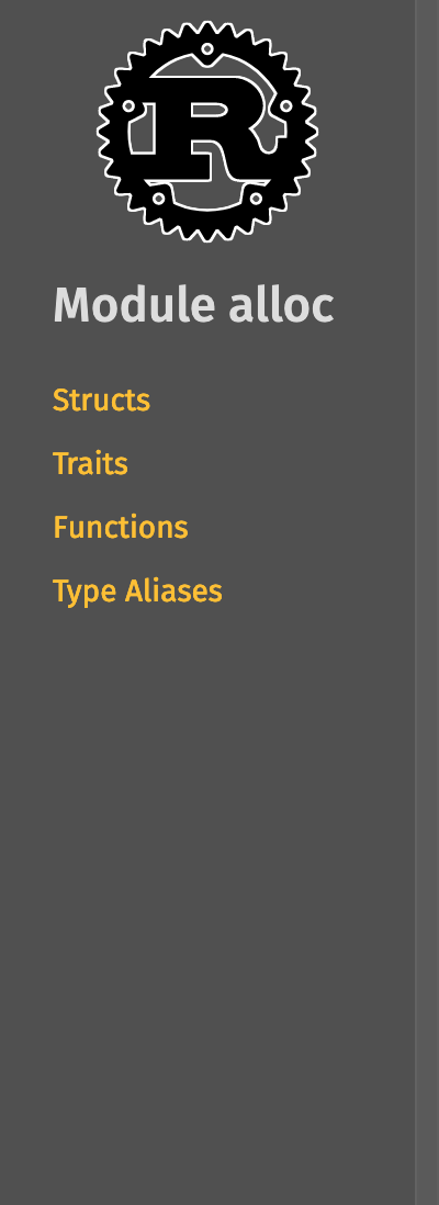
| In module[^1] | 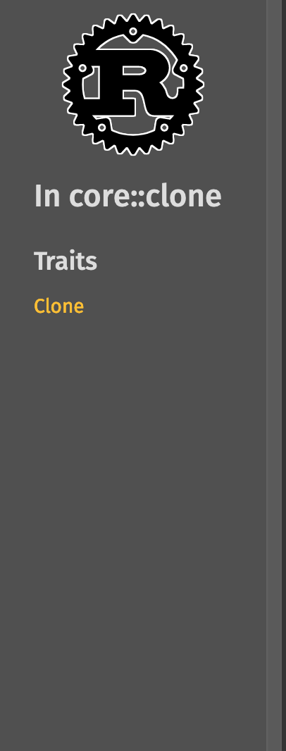 | 
[^1]: This PR also includes a bug fix for derive macros not showing up in the lateral navigation part of the sidebar
</details>
#### Whole sidebar screenshots
| | Macro | Module |
|--|-------|--------|
| In crate | 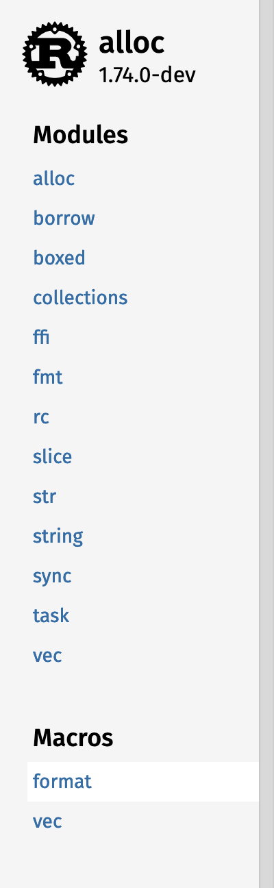 | 
| In module | 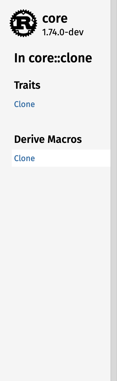 | 
#### Different logo configurations
| | Short crate name | Long crate name |
|---------|------------------|-----------------|
| Root | ![short-root] | ![long-root]
| Subpage | ![short-subpage] | ![long-subpage]
[short-root]: https://github.com/rust-lang/rust/assets/1593513/9e2b4fa8-f581-4106-b562-1e0372c13f79
[short-subpage]: https://github.com/rust-lang/rust/assets/1593513/8331cdb8-fa13-4671-a1e2-dcc1cdca7451
[long-root]: https://github.com/rust-lang/rust/assets/1593513/7d377fec-0f1d-4343-9f82-0e35a8f58056
[long-subpage]: https://github.com/rust-lang/rust/assets/1593513/3b3094a4-63c9-477c-8c15-b6075837df30
##### Without a logo

### Preview pages
https://notriddle.com/rustdoc-html-demo-5/sidebar-layout-rocket/rocket/index.html
https://notriddle.com/rustdoc-html-demo-5/sidebar-layout-rocket/rocket_sync_db_pools/index.html
https://notriddle.com/rustdoc-html-demo-5/sidebar-layout-rust-compiler/index.html
https://notriddle.com/rustdoc-html-demo-5/sidebar-layout-rust/std/index.html
https://notriddle.com/rustdoc-html-demo-5/sidebar-layout-rocket/tokio/index.html
## Motivation
This improves visual information density (the construct with the logo and crate name is *shorter* than the logo on its own, because it's not square) and navigation clarity (we can now see what clicking the Rust logo does, specifically).
Compare this with the layout at [Phoenix's Hexdocs] (which is what this proposal is closely based on), the old proposal on [Internals Discourse] (which always says "Rust standard library" in the sidebar, but doesn't do the side-by-side layout).
[Phoenix's Hexdocs]: https://hexdocs.pm/phoenix/1.7.7/overview.html
[Internals Discourse]: https://internals.rust-lang.org/t/poc-of-a-new-design-for-the-generated-rustdoc/11018
## Guide-level explanation
This PR cleans up some of the sidebar navigation.
It makes the logo in the desktop sidebar a bit smaller, and puts the crate name and version next to it (either beside it, or below it, depending on if there's space), making it clearer what clicking on it does: click the crate name to open the crate's home page. It also removes the Rust logo from non-official-Rust crates, again to make the navigation and supply chain clearer (since the crate name has been added, the logo is no longer necessary for navigation).
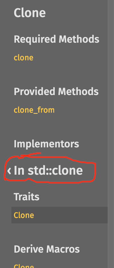
It adds a bit more clarifying information for lateral navigation. On items that don't add their own sidebar items, it just shows its siblings directly below the crate name and logo, but for other items, it shows "In crate alloc" instead of just "In alloc". It also shows the lateral navigation tools on module pages, making modules consistent with every other item.
## Drawbacks
While this actually takes up less screen real estate than the old layout on desktop, it takes up more HTML. It's also a bit more visually complex.
## Rationale and alternatives
I could do what the Internals POC did and keep the vertically stacked layout all the time, instead of doing a horizontal stack where possible. It would take up more screen real estate, though.
## Prior art
This design is lifted almost verbatim from Hexdocs. It seems to work for them. [`opentelemetry_process_propagator`], for example, has a long application name.
[`opentelemetry_process_propagator`]: https://hexdocs.pm/opentelemetry_process_propagator/OpentelemetryProcessPropagator.html
## Unresolved questions
Maybe we should encourage crate authors to include their own logo more often? It certainly helps give people a better sense of "place." This seems to be blocked on coming up with an API to do it without requiring them to host the file somewhere.
## Future possibilities
Beyond this, plenty of other changes could be made to improve the layout, like
* Fix things so that clicking an item in the sidebar doesn't cause it to scroll back to the top.
* The [Internals demo](https://utherii.github.io/new.html) does this right: clicking an item in the sidebar changes the content area, but the sidebar itself does not change. This is nice, because clicking is cheap and I can skim the opening few paragraphs while browsing.
* The layout of the docs sidebar causes trouble to implement this, because it's different on different pages, but at least fix this on the file browser.
* Come up with a less cluttered way to do disclosure. There's a lot of `[-]` on the page.
* We don't lack ideas to fix this one. We have *too many*.
* Do a better job of separating local navigation (vec::Vec links to vec::IntoIter) and the table of contents (vec::Vec links to vec::Vec::new).
* A possibility: add a Back arrow next to the "In [module]" header?
* Give readers more control of how much rustdoc shows them, and giving doc authors more control of how much it generates. Basically, https://github.com/rust-lang/rust/pull/115660 is great, let's do it too.
But those are mostly orthogonal, not future possibilities unlocked by this change.
|
|
|
|
This commit makes three changes for consistency and readability:
- It shows the sibling navigation on module pages. It's weird
that it didn't work before, and is inconsistent with everything
else (even Crates have sibling navigation with other Crates).
- It hides the "In [parent]" header if it's the same as the
current crate, and if there's no other header between them.
We need to keep it on modules and types, since they have
their own header and data between them, and we don't want
to show siblings under a header implying that they're children.
- It adds a margin to deal with the headers butting directly into
the branding lockup.
|
|
This commit changes the layout to something a bit less "look at my logo!!!111"
gigantic, and makes it clearer where clicking the logo will actually take you.
It also means the crate name is persistently at the top of the sidebar, even
when in a sub-item page, and clicking that name takes you back to the root.
| | Short crate name | Long crate name |
|---------|------------------|-----------------|
| Root | ![short-root] | ![long-root]
| Subpage | ![short-subpage] | ![long-subpage]
[short-root]: https://github.com/rust-lang/rust/assets/1593513/fe2ce102-d4b8-44e6-9f7b-68636a907f56
[short-subpage]: https://github.com/rust-lang/rust/assets/1593513/29501663-56c0-4151-b7de-d2637e167125
[long-root]: https://github.com/rust-lang/rust/assets/1593513/f6a385c0-b4c5-4a9c-954b-21b38de4192f
[long-subpage]: https://github.com/rust-lang/rust/assets/1593513/97ec47b4-61bf-4ebe-b461-0d2187b8c6ca
https://notriddle.com/rustdoc-html-demo-4/logo-lockup/image/index.html
https://notriddle.com/rustdoc-html-demo-4/logo-lockup/crossbeam_channel/index.html
https://notriddle.com/rustdoc-html-demo-4/logo-lockup/adler/struct.Adler32.html
https://notriddle.com/rustdoc-html-demo-4/logo-lockup/crossbeam_channel/struct.Sender.html
This improves visual information density (the construct with the logo and
crate name is *shorter* than the logo on its own, because it's not
square) and navigation clarity (we can now see what clicking the Rust logo
does, specifically).
Compare this with the layout at [Phoenix's Hexdocs] (which is what this
proposal is closely based on), the old proposal on [Internals Discourse]
(which always says "Rust standard library" in the sidebar, but doesn't do the
side-by-side layout).
[Phoenix's Hexdocs]: https://hexdocs.pm/phoenix/1.7.7/overview.html
[Internals Discourse]: https://internals.rust-lang.org/t/poc-of-a-new-design-for-the-generated-rustdoc/11018
In newer versions of rustdoc, the crate name and version are always shown in
the sidebar, even in subpages. Clicking the crate name does the same thing
clicking the logo always did: return you to the crate root.
While this actually takes up less screen real estate than the old layout on
desktop, it takes up more HTML. It's also a bit more visually complex.
I could do what the Internals POC did and keep the vertically stacked layout
all the time, instead of doing a horizontal stack where possible. It would
take up more screen real estate, though.
This design is lifted almost verbatim from Hexdocs. It seems to work for them.
[`opentelemetry_process_propagator`], for example, has a long application name.
[`opentelemetry_process_propagator`]: https://hexdocs.pm/opentelemetry_process_propagator/OpentelemetryProcessPropagator.html
Has anyone written the rationale on why the Rust logo shows up on projects that
aren't the standard library? If we turned it off on non-standard crates by
default, it would line wrap crate names a lot less often.
Or maybe we should encourage crate authors to include their own logo more
often? It certainly helps give people a better sense of "place."
I'm not sure of anything that directly follows up this one. Plenty of other
changes could be made to improve the layout, like
* coming up with a less cluttered way to do disclosure (there's a lot of `[-]`
on the page)
* doing a better job of separating lateral navigation (vec::Vec links to
vec::IntoIter) and the table of contents (vec::Vec links to vec::Vec::new)
* giving readers more control of how much rustdoc hows them, and giving doc
authors more control of how much it generates
* better search that reduces the need to browse
But those are mostly orthogonal, not future possibilities unlocked by this change.
|
|
Helps with #90929
This changes the search results, specifically, when there's more than
one impl with an associated item with the same name. For example,
the search queries `simd<i8> -> simd<i8>` and `simd<i64> -> simd<i64>`
don't link to the same function, but most of the functions have the
same names.
This change should probably be FCP-ed, especially since it adds a new
anchor link format for `main.js` to handle, so that URLs like
`struct.Vec.html#impl-AsMut<[T]>-for-Vec<T,+A>/method.as_mut` redirect
to `struct.Vec.html#method.as_mut-2`. It's a strange design, but there
are a few reasons for it:
* I'd like to avoid making the HTML bigger. Obviously, fixing this bug
is going to add at least a little more data to the search index, but
adding more HTML penalises viewers for the benefit of searchers.
* Breaking `struct.Vec.html#method.len` would also be a disappointment.
On the other hand:
* The path-style anchors might be less prone to link rot than the numbered
anchors. It's definitely less likely to have URLs that appear to "work",
but silently point at the wrong thing.
* This commit arranges the path-style anchor to redirect to the numbered
anchor. Nothing stops rustdoc from doing the opposite, making path-style
anchors the default and redirecting the "legacy" numbered ones.
|
|
|
|
|
|
|
|
|
|
|
|
|
|
|
|
|
|
map_identity
filter_next
option_as_ref_deref
unnecessary_find_map
redundant_slicing
unnecessary_unwrap
bool_comparison
derivable_impls
manual_flatten
needless_borrowed_reference
|
|
|
