| Age | Commit message (Collapse) | Author | Lines |
|---|
|
|
|
Otherwise on systems where Arial is not available the system will
fallback to a serif font, rather than a sans-serif one.
This is especially relevant on acessibility-conscious setups (such as is
mine) that have web-fonts disabled and a limited set of fonts available
on the system.
|
|
Fix "run" button position in error index
This isn't really a rustdoc issue but I still made the same fix in the `rustdoc.css` file (doesn't hurt).
Before:

After:

cc ````@jyn514```` (considering this is quite a big bug and an easy fix)
r? ````@Nemo157````
|
|
|
|
|
|
|
|
On most platforms and browsers, `sans-serif` is equivalent to Arial.
However, on Firefox on Ubuntu (and possibly other Linuxes), `sans-serif`
is DejaVu Sans, a much wider font. This creates a larger shift in text
when the custom fonts finally load. Arial is a web-safe font, and
specifying it explicitly gives us more cross-platform consistency, as
well as reducing the layout shift that happens when fonts load.
|
|
Add font-display: swap. Per https://web.dev/font-display/, this prevents
"flash of invisible text" during load by using a system font until the
custom font is available. I've noticed this flash of invisible text
occasionally when reading Rust docs.
Add an explicit height to icons (which already had an explicit width)
to allow browsers to lay out the page more accurately before the icons
have been loaded. https://web.dev/optimize-cls/.
Add min-width: 115px to the crate search dropdown. When the HTML first
loads, this dropdown includes only the text "All crates." Later, JS
loads the items underneath it, some of which are wider. That causes
the dropdown to get wider, causing a distracting reflow. This sets a
min-width based on the size that the dropdown eventually becomes based
on the crates on doc.rust-lang.org, reducing page movement during load.
|
|
For browsers that support woff2 (most modern ones:
https://caniuse.com/woff2), this offers a reduction in download size
for these two fonts from 362k to 257k (32% reduction). It decreases the
total page size for `struct.String.html` (counting all subresources) by
about 2.5%.
If this is interesting, I'm happy to apply the same treatment to the
other fonts, but these two are the biggest.
|
|
|
|
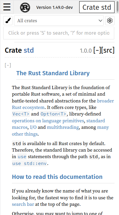
Fix overflowing text on mobile when sidebar is displayed
Fixes #81597.
Before:

After:

cc `@pickfire`
r? `@Nemo157`
|
|
|
|
Rustdoc UI fixes
The first commit fixes this bug (I couldn't figure out why we were setting the width manually and it works as expected without so...):

The second commit fixes a small bug. On tablets or computer with very little width, the search section goes "over" the search input, making it impossible to click on the search input:

The third and last commit fixes two bugs that you can see in this screenshot:

The wheel is going over the search input and the search tab is going under the search results text. The bug was fixed by simply switching to "mobile mode" at a bigger width:

cc ```@pickfire```
r? ```@Nemo157```
|
|
|
|
|
|
Improve docblock readability on small screen
Before

After

Too much space is wasted on the left side. I wanted to make that 0 but it breaks some part with error symbols.
0

After

|
|
|
|
|
|
|
|
Fix #81377
|
|
This fixes a mobile UI bug where a vertical scrollbar would always be
rendered on the sidebar nav when the menu was closed.
|
|
Fix search section position on small devices
Fixes #79526.
This is exactly the same issue fixed in 9c36491538476dd3ff5ec834944aacdaceb12f30 (in https://github.com/rust-lang/rust/pull/79936) but applied to the search section. When the width becomes too small, the search input goes on its own line to get more space, making it go "under" the section following (so either "main" or "search"). The fix is to simply make the section go more under so that it doesn't go over the search input.
r? `@jyn514`
|
|
Use sans-serif font for the "all items" page links
The "all items" pages' links aren't using a sans-serif font unlike the rest of equivalent items in the other module pages. ``@Nemo157`` reported me this issue so here is the fix!
r? ``@Nemo157``
|
|
|
|
|
|
r=Nemo157
Move tooltips messages out of html
First thing first: nothing in the output has changed. You still have the "i" on the left of code blocks examples when they have `ignore`, `compile_fail`, `should_panic` and `edition`. The behavior also remains the same: when you hover the "i", you have the corresponding message showing up.
So now, why this PR then? I realized recently that we were actually generating those messages into the HTML every time whereas all messages are the same (except for the edition ones, I'll come back to it later). So instead of generating more content, I simply moved it inside the CSS thanks to pseudo elements (`::before` and `::after`). The message is now inside `::after` and we use the `::before` to have the small triangle on the left of the message. So now, we have less HTML generated which is seems pretty nice.
So now, back to the `edition` change: the message is globally the same, but the "edition" itself can be different (2015 or 2018 currently, I expect 2021 to arrive not too far in the future). So the only difference for it is that I added a new attribute on the tooltip called `edition` which contains this information. Then, the `::after` uses it inside its `content` (you can get the content of an element's attribute by using `attr` and concat different strings by simply having them after the other).
Don't hesitate if a part of my explanations isn't clear.
r? `@jyn514`
|
|
|
|
Fix item name display on mobile
Fixes https://github.com/rust-lang/docs.rs/issues/1200


cc `@jyn514`
r? `@Nemo157`
|
|
|
|
|
|
|
|
|
|
|
|
|
|
Greatly improve display for small mobile devices screens
Fixes #78014.
The biggest change being the "search bar". Instead of having everything on one line, I decided to move the search input on its own:

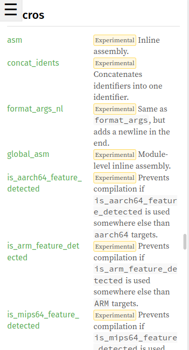
Another change is that now, we "break words" in the listing so that they don't grow too big:

r? @jyn514
|
|
|
|
|
|
Small CSS cleanup
r? @jyn514
|
|
|
|
Hide help button on mobile
Addresses #77899.
This PR is just a quick fix for now: we're still debating about whether or not we want to display this help popup and if so, how. I'll open an issue once this PR is merged to discuss about it.
Before:

After:

r? @jyn514
|
|
|
|
Add word wrap for short descriptions
Fixes #77652

cc @WaffleLapkin
r? @jyn514
|
|
|
|
|
|
|
|
Fixes an issue where links in the one-line version of an item's docs
would be in Fira Sans, while the rest would be in a serifed font.
|
|
I had put it in the wrong file in #76126. This should fix it now. Thank
you to @ollie27 for pointing this out!
|
|
|
|
Add help button
Part of #75197.
Here is a screenshot of the result:

r? @jyn514
|
|
|
