| Age | Commit message (Collapse) | Author | Lines |
|---|
|
|
|
Add help button
Part of #75197.
Here is a screenshot of the result:

r? @jyn514
|
|
Only add a border for the rust logo


I didn't add a border for the light theme though, as I felt it as unnecessary.
r? @Manishearth
|
|
|
|
* Rename it in the UI
* Rename the CSS classes
|
|
|
|
Co-authored-by: Cldfire <cldfire@3grid.net>
|
|
|
|
Add right border bar to Dark and Light theme
Demo:
Light theme: https://github.com/rust-lang/rust/pull/74504#issuecomment-662491120
Dark theme: https://github.com/rust-lang/rust/pull/74504#issuecomment-662522446
Ayu theme: https://github.com/rust-lang/rust/pull/74504#issuecomment-662625685
|
|
Improve doc theme logo display
Fixes #74350.
The first commit cleans up the whitespaces and converts them to tabs. We should definitely write a tidy check for this (will do it in another PR).
Screenshots:

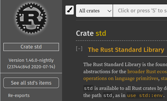

r? @lzutao
cc @Cldfire
|
|
Ayu has it. Adding similar rule to other themes makes users less
surprised and makes GUI more consistent.
|
|
Co-authored-by: Cldfire <cldfire@3grid.net>
|
|
Fix tooltip position if the documentation starts with a code block
Fixes #74321.
Before:

After:

And in case there is text, it is not being applied:

And on mobile it isn't needed so it's not "activated":

r? @rust-lang/rustdoc
|
|
|
|
Improve "important traits" popup display on mobile
I implemented what @XAMPPRocky suggested in the [internals thread topic](https://internals.rust-lang.org/t/feedback-on-important-traits-rustdoc-feature/12752/18). I can confirm it works nicely.
r? @Manishearth
@Manishearth: By the way: I realized that when you click on the "i", you have to click again to make the popup disappear. Do you want me to extend the popup removal to any click outside the popup?
|
|
Fix search input focus in ayu theme
Closes #74496.
Before:

After:

|
|
|
|
Co-authored-by: Cldfire <cldfire@3grid.net>
|
|
|
|
|
|
|
|
|
|
|
|
Improve ayu rustdoc theme
This PR changes the following:
* It makes some lines darker
* It gives the crate selector and search bar a border
* The search bar's border turns blue when focused
* ~~Gives the logo a bright shadow.~~
For standard library crates, it would be better to invert the logo, but that would be bad for crates with a colored logo, e.g. [async-std](https://docs.rs/async-std/1.6.2/async_std/).
Before:

After (note that this PR no longer includes the white shadow of the logo):

|
|
r=Mark-Simulacrum
Do not render unstable items for rustc doc
See the zulip conversion: https://rust-lang.zulipchat.com/#narrow/stream/131828-t-compiler/topic/rustc.20doc.3A.20.22internal.20compiler.20API.22.20warns.20are.20everywhere!/near/203850782
Before:

After:

Nothing changes in unstable items of std:
Before:

After:

Closes #54682
|
|
Reintroduce spotlight / "important traits" feature
(Reopened version of https://github.com/rust-lang/rust/pull/74111 because Github is broken, see discussion there)
Fixes https://github.com/rust-lang/rust/issues/73785
This PR reintroduces the "spotlight" ("important traits") feature.
A couple changes have been made:
As there were concerns about its visibility, it has been moved to be next to the return type, as opposed to being on the side.
It also no longer produces a modal, it shows the traits on hover, and it can be clicked on to pin the hover bubble.


It also works fine on mobile:

|
|
Focus on the current file in the source file sidebar
Fixes #73360.
r? @kinnison
cc @rust-lang/rustdoc
|
|
We need it for run buttons (https://github.com/rust-lang/rust/pull/44671), but not function defs
|
|
|
|
|
|
|
|
This makes the spotlight show on hover instead of click. Clicks can be
used to persist it, which is also what's used on mobile.
|
|
|
|
This reverts commit 1244ced9580b942926afc06815e0691cf3f4a846.
|
|
|
|
|
|
r=Dylan-DPC
Add margin after doc search results
I found it not really on computer that the last result is right at the bottom of the page. I find it better with margin below (especially when you hover the last element!). A screenshot to show the result:

r? @kinnison
cc @rust-lang/rustdoc @Manishearth @jyn514
|
|
r=Manishearth
Add option to collapse automatically implementors
Fixes #73403
It adds an option (enabled by default) which collapses all implementors impl blocks.
r? @kinnison
cc @rust-lang/rustdoc
|
|
* It makes some lines darker
* It gives the crate selector and search bar a border
* The search bar's border turns blue when focused
* Gives the logo a bright shadow. This makes dark logos stand out more
|
|
|
|
|
|
|
|
|
|
|
|
rustdoc: Restore underline text decoration on hover for FQN in header
This causes the components of FQN's (e.g. `std`, `net`, and `Ipv4Addr` of the FQN `std::net::Ipv4Addr`) to behave similarly to other links in the contents of rustdoc-styled pages. When the user hovers over them, more clearly indicating that they can be used for navigation.
I (and I hope others at least in part) have found the prior design to be somewhat confusing, as it is not clear (upon hovering) that the various parts of the FQN are actually links that the user can navigate to.
<details><summary>📸 Before, mouse hovered over "net" in the FQN</summary>
<img alt="A rustdoc page with the mouse hovered over the fully-qualified name in the page header, producing no visual change" src="https://user-images.githubusercontent.com/1566689/86538363-4c827000-bebb-11ea-8291-5ea6b85d7e19.png" />
</details>
<details><summary>📸 After, mouse hovered over "net" in the FQN</summary>
<img alt="A rustdoc page with the mouse hovered over the fully-qualified name in the page header, now with an underline showing up under the word hovered over by the mouse" src="https://user-images.githubusercontent.com/1566689/86538471-d3374d00-bebb-11ea-9bb3-7aa2d7a4800b.png" />
</details>
|
|
This causes the components of FQN's to behave similarly to other links
in the contents of rustdoc-styled pages.
I (and I hope others at least in part) have found the prior design to be
somewhat confusing, as it is not clear (upon hovering) that the various
parts of the FQN are actually links that the user can navigate to.
In short, this patch makes links in the FQN have an underline when the
user hovers over them, more clearly indicating that they can be used for
navigation.
Signed-off-by: Kristofer Rye <kristofer.rye@gmail.com>
|
|
|
|
|
|
|
|
|
